However, out and about later that year, I came across a booklet of postcards of Edward Hopper's work, and bought it for Bill, because Nighthawks was his choice, and he loved it. Flicking through the pics on my way home, I was very surprised to find that I really liked most of them and, in the context of these others, I began to 'get' Nighthawks. So here's a selection of Edward Hopper's work.
I found this Artchive profile interesting too: not an easy man to be with (or to be?) but it's apparent where the paintings come from; they're definitely him.
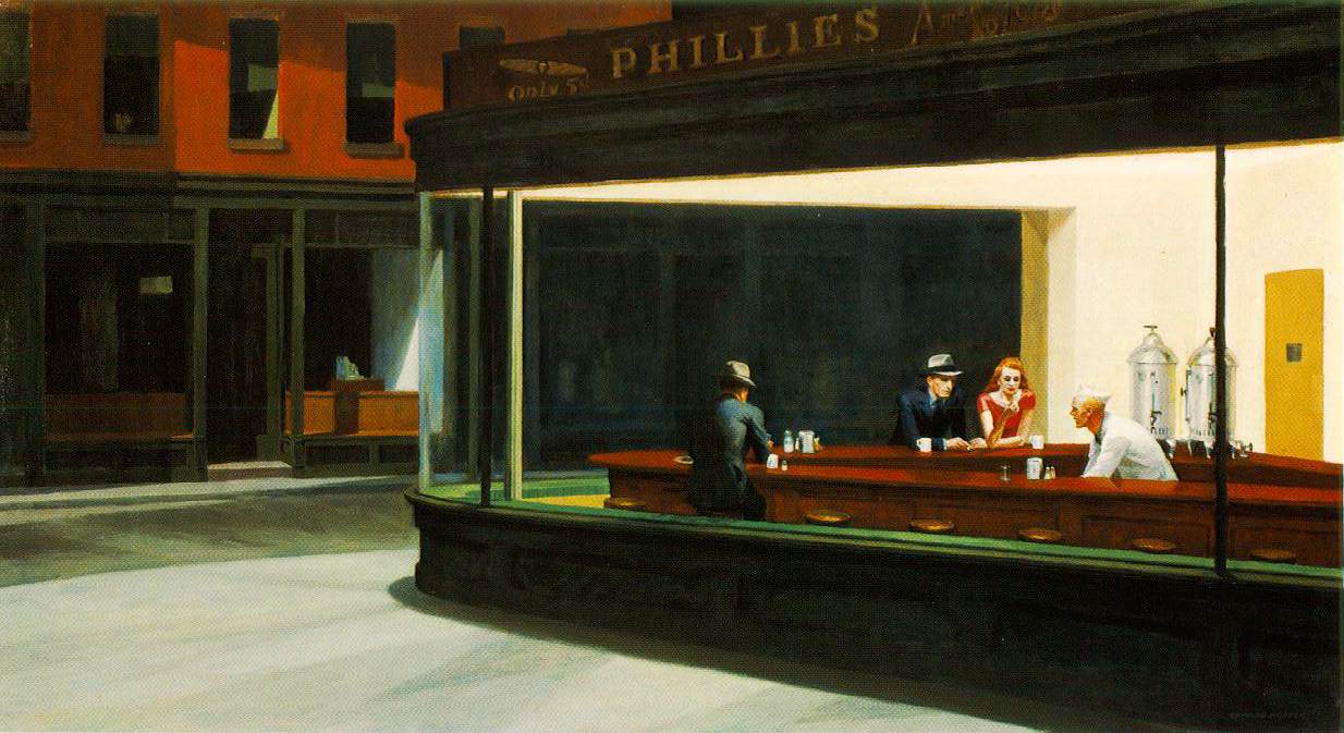
He painted Nighthawks in 1942, so it's not surprising that it reminds me of Raymond Chandler novels and movies. Think of The Maltese Falcon (Chandler? Not sure.) or The Big Sleep. Can you hear Humphrey Bogart's sardonic commentary? Is that Lauren Bacall, or Rita Hayworth at the end of a long day's filming, taking the weight off aching feet? I am also reminded of the end of the Helen Hunt/Jack Nicholson/Greg Kinnear movie, As Good As It Gets, when Melvin and Carol take a walk in the small hours, and the Turkish bakery is just opening. Not so lonely after all. Love that film.
 I believe that this was the postcard print that made the difference for me. I have an applique book somewhere that explains that colours can be categorised as hues (pure colour), tints (with white in them), shades (black) and something else that I can't remember, but they contain grey! Hopper's paintings, I think have that grey tone (Ah! Tone. Not sure, but that might be it.) and I think that's the most basic, unprocessed reason why some of them repel me: and the reason for that, I think, is my perception that while life is full (FULL!) of pretty coloured lanterns, just beyond and around the pools of light, there is shadow. Hopper lets the shadow into his sunniest pictures. And this is one of them.
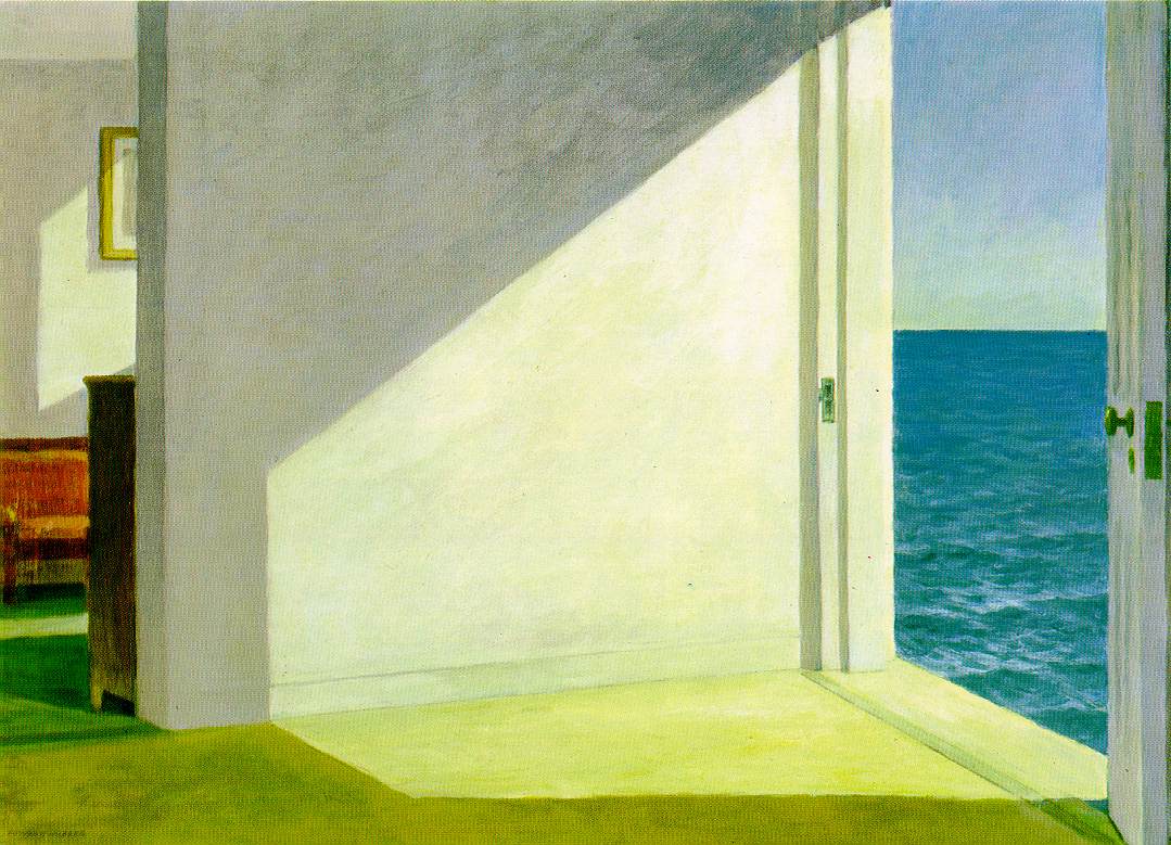
I enjoy the literal edginess of this painting (Rooms by the Sea, 1951), because being by the sea has this strongly defined quality. By the sea, I am fully aware of air moving restlessly on my skin and in my hair and clothes; of the variety and texture of the sand, shell, gravel and bottletops underfoot; of sea that stretches so far and so thin that at the horizon it metamorphoses into sky and curves up and over, high overhead, to curve down far behind me, where all the other stuff is; of the smell of the sea, too vigorous and elemental to be parcelled into subtle, self-conscious words like aroma, fragrance, perfume - it's not just my nose that absorbs the smell of the sea, it's my skin, my eyes, my ears; and the sound of the sea, and moving air, and the voices of birds and people floating in the breadth and height and depth of it all like small balloons. This must be the source of the speech bubble!
If Hopper had painted someone in these rooms, I don't think that I would feel the same way about it, because his people are as sharply defined as his landscapes and interiors: they might all be in the same painting, but they are all separate. I have a sense of being in his 'empty' paintings, but of observing isolation in his peopled (?) canvases. Hmm.... fancies herself as an art critic this morning... probably should have gone with Plan A, Go to the Gym. But I've had these pics on the hard drive for ages, and I really wanted to get them up here before I go away!

Here's 'Gas', 1940. Not lonely! I like this very much. For me, the mood is of that quiet absorption in doing a routine job right. There's a feeling of a natural rhythm of life. The trees are dark, and the shadows are long, but isn't that what you want at the end of a busy day? Finish off, and go put your feet up with a cup of tea, some music, and a good book.

Cape Cod Evening, 1939. What do you think?
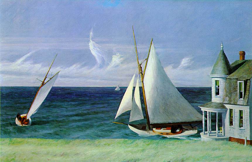
And I love this! The Lee Shore, 1941 Wheeeeeeee!
No comments:
Post a Comment